Heel holland burgert:
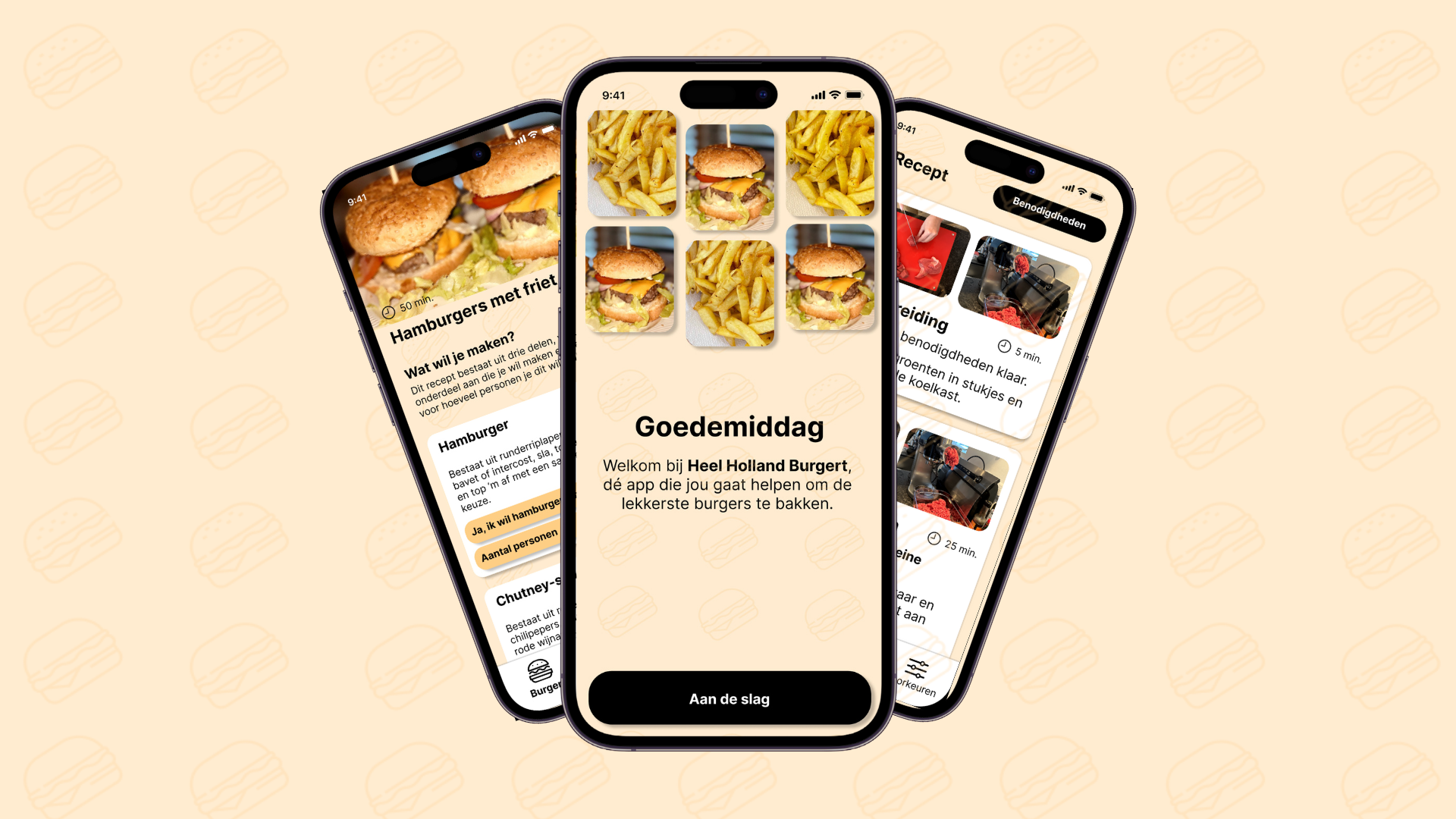
We were tasked with designing an app that would allow users to prepare a dish by following clear,
step-by-step instructions. As we developed the concept further, we expanded the functionality to
create a more personalized and practical cooking experience. This included features such as
selecting allergies, adjusting the number of servings, and integrating a shopping assistant that
allows users to send ingredients directly to their shopping list or preferred grocery service.
Throughout the process, we focused on making the app not only informative, but also intuitive and
adaptable to different user needs. By combining guidance, customization options, and smart
shortcuts, the app aimed to streamline the entire cooking journey from choosing a recipe to
gathering
ingredients and preparing the final dish.
What made this project particularly challenging for me was developing a fully functional prototype
in Figma. It took a lot of time and attention to ensure that users could really navigate through the
entire app, with all screens, options, and functionalities logically connected. This meant I had to
think not only about design, but especially about user flow, interactions, and consistency within
the design.
You can view the the
Figma prototype here and all previous
versions and multiple itterations here.

Whoppah redesign
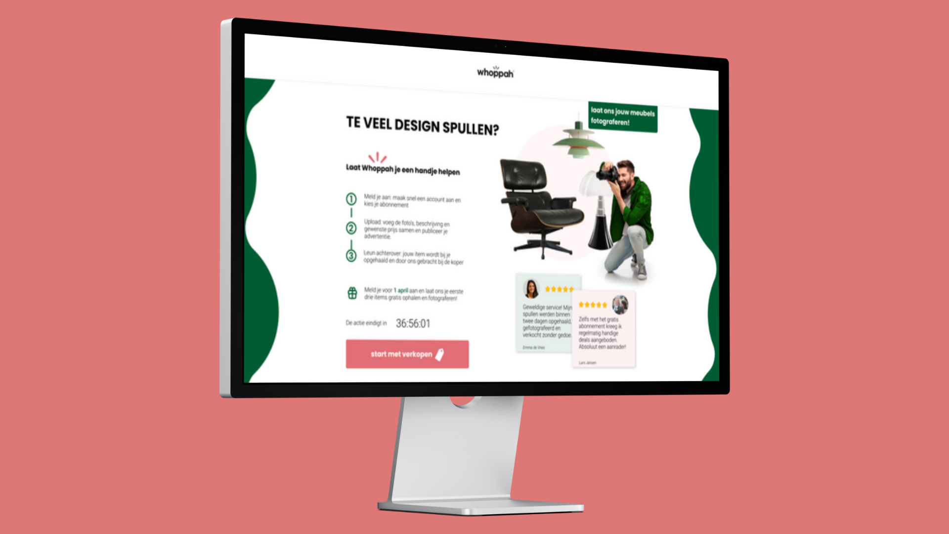
Whoppah tasked us with redesigning their web pages because they were facing a significant problem at
the time: more purchases were being made than new products were being offered. For an online
marketplace, this is obviously an unhealthy ratio.
To get a good idea of the cause, we started with a thorough analysis of the existing pages. We soon
discovered that nowhere was it clearly explained how users could sell their items, nor was there a
convincing explanation of why selling via Whoppah was interesting in the first place. The value
proposition for sellers was completely missing.
That is why we started creating multiple iterations of different design concepts, focusing primarily
on the seller and what they are looking for in a platform such as Whoppah. In addition, we
researched persuasion techniques, which led to the introduction of different tiers for sellers, each
with its own advantages. User tests also showed that elements such as a “most chosen” labels and
testimonials are very
effective in guiding choices.
The most challenging aspect of this project was finding a balance between the wishes of the user and
the expectations of the client. In addition, the process required many iterations to arrive at a
design that was functional, persuasive and user-friendly.
You can view the
finished page here and
previous
iterations along side our analysis here.


