One page menu in the style of Jurriaan Schrofer
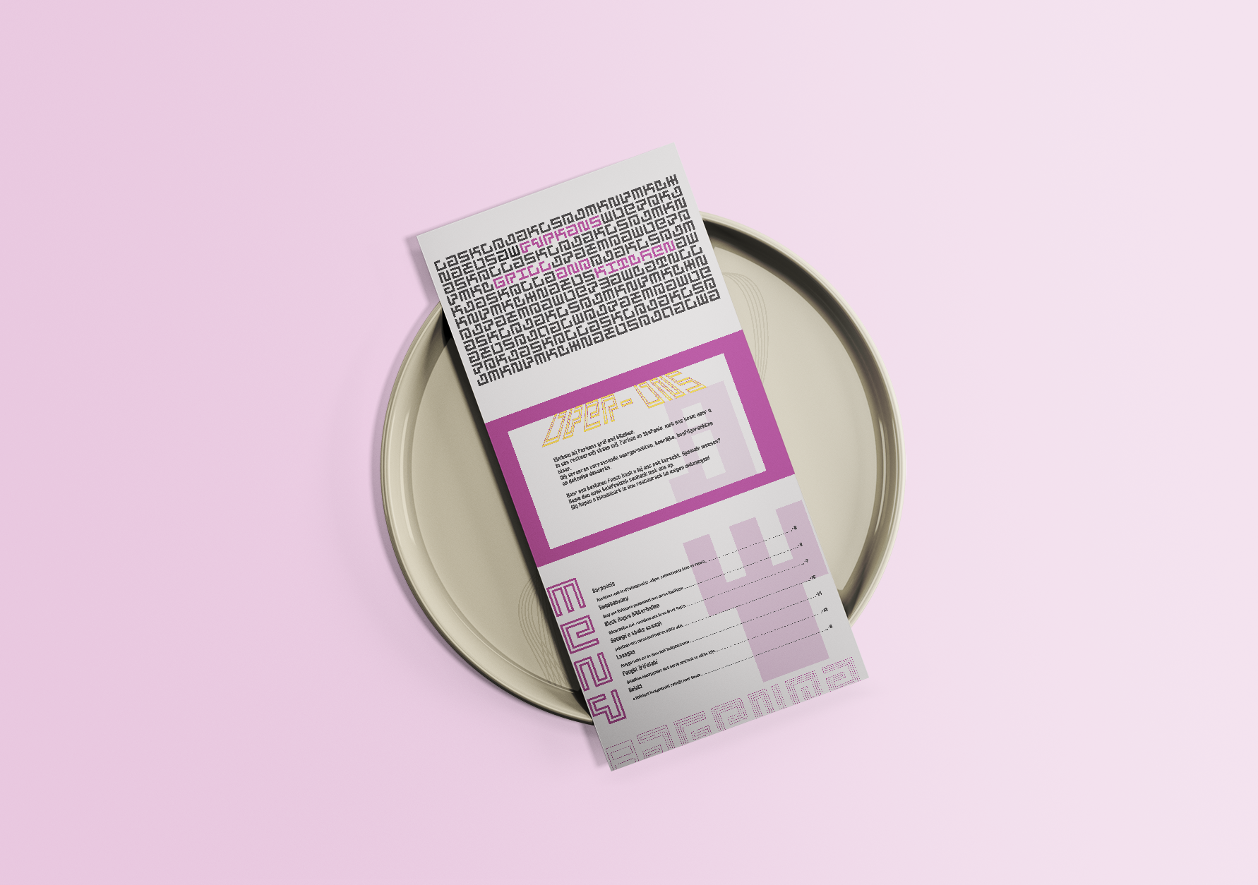
This is a menu design for a fictional restaurant in the style of the Dutch designer Jurriaan Schrofer. For this project, I had to research various elements, such as how Jurriaan created his designs and apply them in a unique yet still recognizable manner, incorporating his signature design elements.
The challenge:
The design challenge was to investigate what made Jurriaan's work unique and then create a design in his style while incorporating the given content provided by the client.
My role and duration:
In this project, I was the sole designer, and I created everything myself. It took me approximately one month to complete. excluding the research.
The Proces:
For this project, my first step was to research Jurriaan's work. I discovered that he extensively used typography in a grid and created entire images solely from letters. Keeping this in mind, I began investigating how he created his letters. He crafted his letters within grids of varying sizes, forming letters and symbols entirely within that grid. With all this research in mind, I started designing the individual elements. For each page, I took inspiration from one of his works to inform my design.
The result is a complete poster, designed in the style of Schrofer, that provides all the necessary information to understand everything about the restaurant in a beautiful and engaging manner.
Check out the entire design and my design rationale with all my choices and the previous version on the second page